

Performance dashboard
The Performance dashboard shows how the work is spread: how many messages each person on your team sent day by day, at which hours and on which days new tickets arrive, and how often your templates and auto-response rules are used. Team leads use it to balance the workload, plan who works when, and see whether automation pulls its weight. Open it from DashboardPerformance in the sidebar. Every widget covers the period you choose, the last 7 days when you open the screen, for your whole company.
What you can do here
Section titled “What you can do here”- See who sent how many messages. A line per user counts every message they sent each day; messages without a user, such as auto-responses, form their own line. See messages sent per user
- See when tickets arrive. A heatmap counts new tickets by hour and weekday, so you can staff the busy hours. See when tickets arrive
- See which templates your team relies on. A table and a pie chart count the messages sent from each template, auto-responses included. See which templates your team uses · Reply templates
- See which auto-response rules fire. A table and a pie chart count the auto-responses each rule sent. See which auto-responses go out · Auto-responses for tickets
- Choose the period and narrow to accounts or marketplaces. The same period and filters as on the Overview dashboard, without the working-hours choice. Choose the period and filter
- Arrange the dashboard for yourself. Hide, move, resize and remove the four widgets; the layout is saved for your user only. Arrange your dashboard
The screen at a glance
Section titled “The screen at a glance”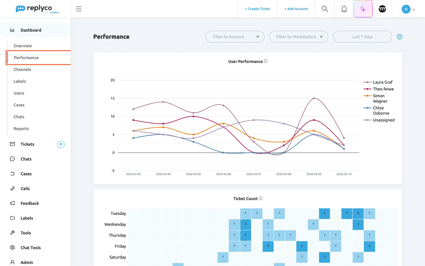
What this screenshot shows
- Screen
- Performance (/dashboard/performance)
- Highlighted
- menuitem “Performance”, sidebar-left, selected. opens the Performance dashboard
- Also visible
- Dashboard menu expanded; header: account filter, marketplace filter, period Last 7 days, gear icon; User Performance line chart with five series from 3 to 10 March; top of the Ticket Count heatmap
- Purpose
- the Performance dashboard as it opens
| Region | What it shows | What you do there |
|---|---|---|
| Performance in the sidebar, under Dashboard | The second dashboard; a padlock when your subscription lacks Advanced Reporting | Open the dashboard |
| Header, right | Filter by Account, Filter by Marketplace, the period button and a gear icon | Narrow the widgets, choose the period, arrange widgets |
| User Performance | Messages sent per user per day, one line each | Compare workload between people |
| Ticket Count | New tickets by hour and weekday, as a heatmap | Find the busy hours |
| Templates Usage | Messages per template, as a table and a pie chart | See which templates are used |
| Autoresponses Usage | Auto-responses per rule, as a table and a pie chart | See which rules fire |
The four widgets are shown in this order when you first use the dashboard. While a widget loads it shows grey placeholder bars; a widget with nothing to show displays a frown and No data....
See messages sent per user
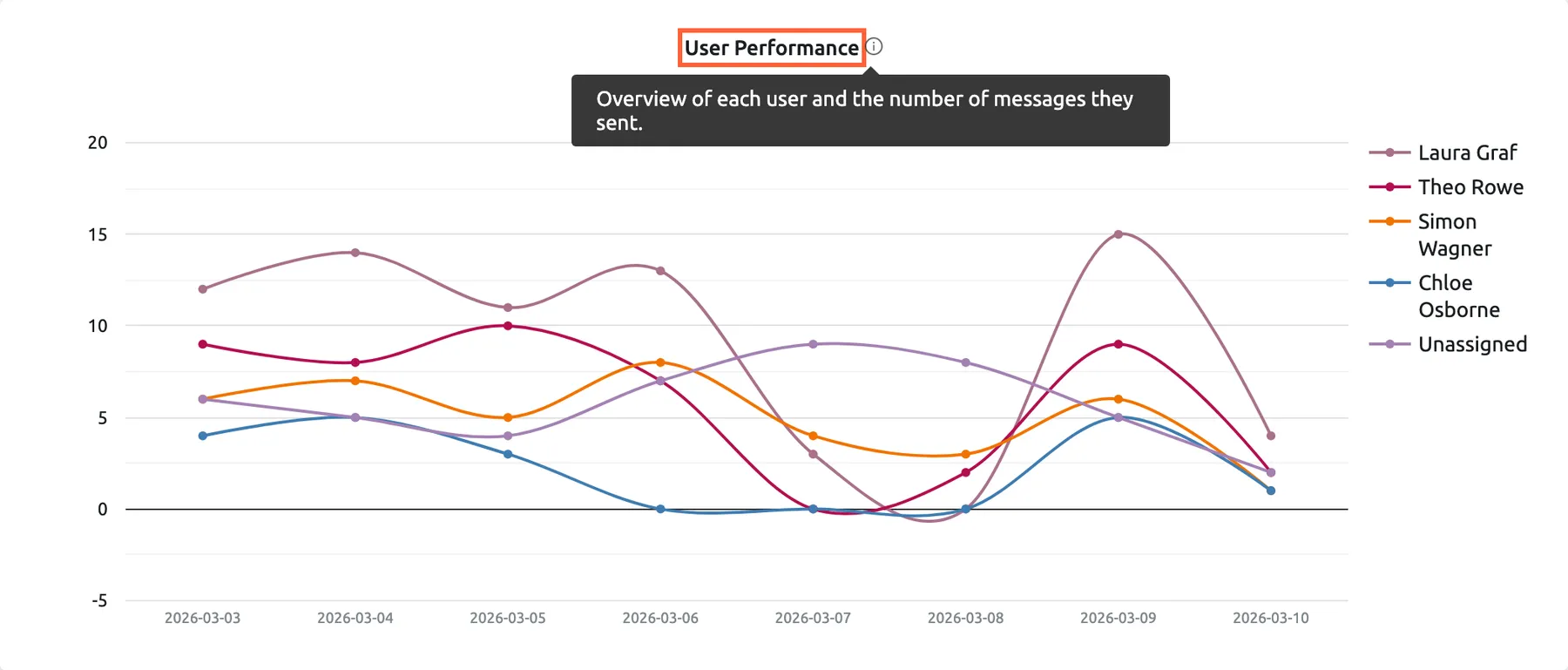
Section titled “See messages sent per user”User Performance draws one line per user with the number of messages that user sent from Replyco on each day of the period. A line called Unassigned collects the messages no user sent: auto-responses and messages sent outside Replyco. The legend on the right names each line; hover over a point for the exact number.
What this screenshot shows
- Screen
- Performance (/dashboard/performance)
- Highlighted
- heading “User Performance”, user-performance-widget, tooltip-open. explains what the chart counts
- Also visible
- tooltip with the widget description; five lines: four users and Unassigned; dates 2026-03-03 to 2026-03-10
- Purpose
- read what User Performance counts
The chart counts every message a user sent, a follow-up to a customer or a second reply in a row included. Messages to blocked customers are left out; messages in archived tickets count.
The chart changes its steps with the length of the period:
| First and last day of the period are | One point per | Example |
|---|---|---|
| Less than 29 days apart | Day, dated 2026-03-03 and so on | Last 7 days |
| 29 days to under a year apart | Month | Last 30 days, Last 90 days |
| A year or more apart | Year | A custom range over two years |
Example. In the week from 3 to 10 March, Laura Graf sent 12 to 15 messages on most weekdays and Chloe Osborne none on Friday. On Saturday and Sunday the users’ lines fall and Unassigned rises: the weekend auto-response is answering instead. The team lead moves two of Laura’s accounts to Chloe for the next week.
See when tickets arrive
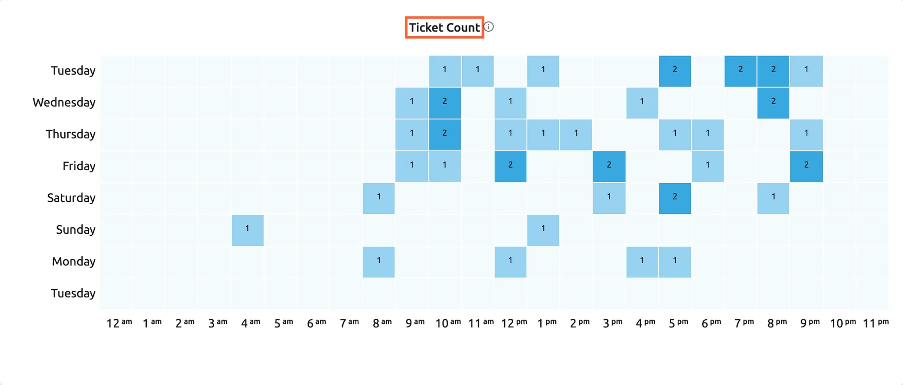
Section titled “See when tickets arrive”Ticket Count is a heatmap of the tickets created in the period. Each cell holds the number of new tickets; the darker the blue, the more tickets, compared with the busiest cell. Empty cells had none. The times follow the time zone of your computer, and the names of days and months and the hour format follow the language of your screen.
What this screenshot shows
- Screen
- Performance (/dashboard/performance)
- Highlighted
- heading “Ticket Count”, ticket-count-widget, enabled. shows created tickets per weekday and hour
- Also visible
- eight rows Tuesday to Tuesday; 24 hour columns from 12 am to 11 pm; cells with 1 or 2 tickets, peaks late morning and evening
- Purpose
- see when tickets arrive
The layout depends on the length of the period:
| First and last day of the period are | Rows | Columns |
|---|---|---|
| Less than 8 days apart | The eight days up to the end of the period, by weekday | Hours from 12 am to 11 pm |
| 8 days to under 113 days apart | The weeks up to the end of the period | Weekdays, Monday to Sunday |
| 113 days to under a year apart | The twelve months up to the end of the period | Weeks of the month |
| A year or more apart | Years | Months |
Example. The heatmap for the last 7 days shows most new tickets on weekdays between 9 am and noon, and a second wave from 5 pm to 9 pm, when customers write after work. Northwind Electronics moves one colleague’s shift to 12:00–20:00 so the evening wave is answered the same day.
See which templates your team uses
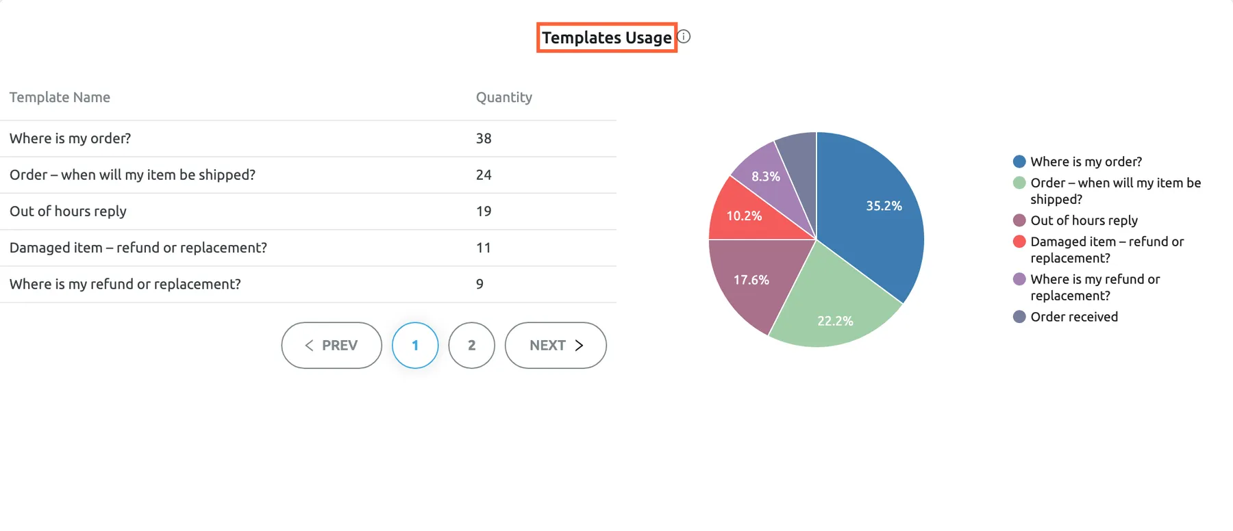
Section titled “See which templates your team uses”Templates Usage counts the messages sent in the period that were based on each template, auto-responses that send a template included. The table on the left lists every template with its Quantity, the most used first, five per page, including templates nobody used. The pie chart on the right shows the share of each used template.
What this screenshot shows
- Screen
- Performance (/dashboard/performance)
- Highlighted
- heading “Templates Usage”, templates-usage-widget, enabled. lists how often each template was used
- Also visible
- table Template Name and Quantity, five rows per page; pie chart with the share of each used template
- Purpose
- see which templates the team relies on
A message counts for a template when the reply was started from it, whatever was edited afterwards, and every use counts, delivered or not. Templates you deleted are no longer in the table. The pie chart shows the eight most used templates and adds the rest together in one more slice.
Example. “Where is my order?” was used 38 times in a week, “Holiday reply” not at all. The team lead adds tracking details to the first template, since it answers a third of all template replies, and switches the second off until the next holiday. To change templates, see Templates and Reply templates.
See which auto-responses go out
Section titled “See which auto-responses go out”Autoresponses Usage counts the auto-responses each rule sent successfully in the period. The table lists every auto-response rule with its Quantity, the most used first, including rules that sent nothing; the pie chart shows the share of each rule that sent something.
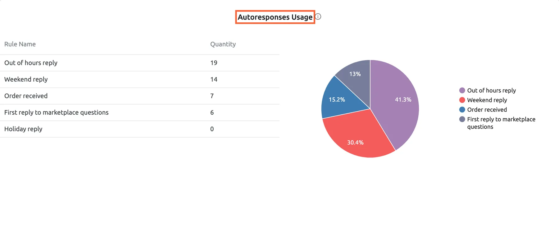
What this screenshot shows
- Screen
- Performance (/dashboard/performance)
- Highlighted
- heading “Autoresponses Usage”, autoresponses-usage-widget, enabled. lists how many auto-responses each rule sent
- Also visible
- table Rule Name and Quantity with five rules; pie chart with four slices
- Purpose
- see which auto-response rules fire
Auto-responses that failed to send are not counted here. A rule that sends a template also counts for that template in Templates Usage, so the same message appears in both widgets. Auto-responses are also the main part of the Unassigned line in User Performance.
Example. “Out of hours reply” sent 19 auto-responses and “Weekend reply” 14 in a week, while “Holiday reply” sent none. Nothing is wrong with the holiday rule: it only fires on your holidays. To check when a rule fires, see Auto-responses for tickets and the Auto-response Rules screen.
Choose the period and filter
Section titled “Choose the period and filter”-
Select the period button in the header and choose a period, or pick your own start and end date.
-
To narrow the widgets, tick accounts under Filter by Account or channels under Filter by Marketplace.
-
Every widget reloads as soon as you choose.
The period and filters work exactly as on the Overview dashboard: Last 7 days covers today and the seven days before, both filters apply together, and nothing is remembered when you leave. The Performance dashboard has no Calendar Hours or Working Hours choice, because none of its widgets measures time. For every detail, see Overview dashboard.
Arrange your dashboard
Section titled “Arrange your dashboard”-
Select the gear icon at the right of the header, then Manage Widgets.
-
Clear a check box to remove that widget from your view, or tick it to add the widget back at the bottom.
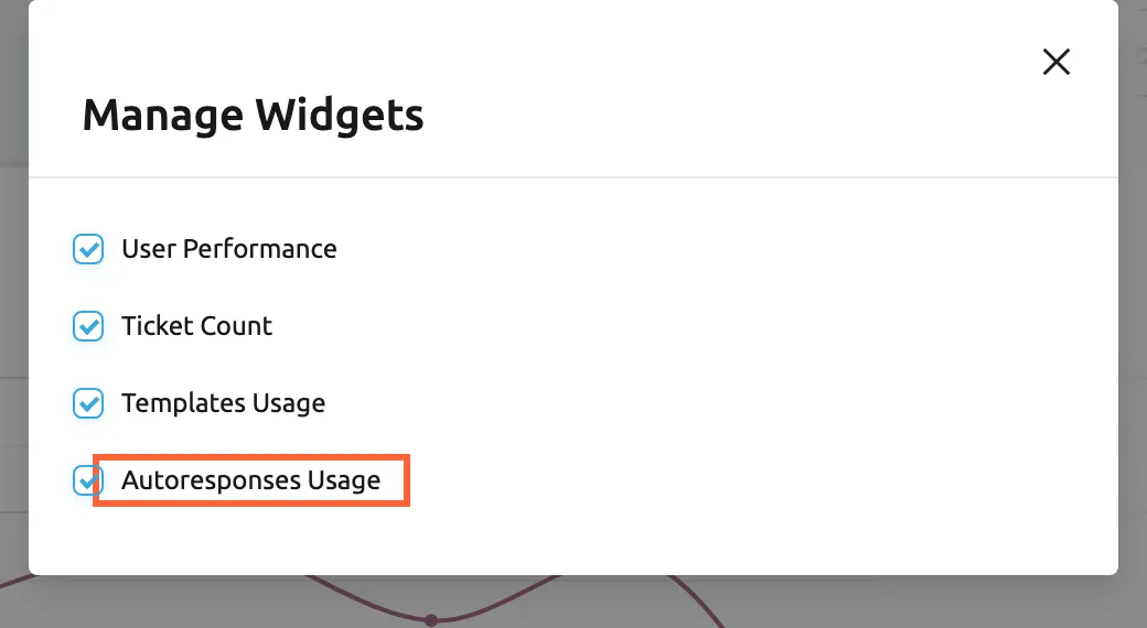
Manage Widgets shows or hides the four Performance widgets on your own view. What this screenshot shows
- Screen
- Performance (/dashboard/performance)
- Highlighted
- checkbox “Autoresponses Usage”, dialog, checked. hides or shows the Autoresponses Usage widget
- Also visible
- four widget check boxes, all ticked; close button
- Purpose
- choose which widgets you see
To move or resize widgets, select the gear icon, then Turn ON Edit Mode, drag the widgets or their bottom right handle, and finish with Turn OFF Edit Mode. The cross at a widget’s top right removes it after Are you sure you want to delete this Widget?. The layout is saved for your user only; colleagues keep theirs.
Every control, explained
Section titled “Every control, explained”Performance in the sidebar
Section titled “Performance in the sidebar”The sidebar, under Dashboard, the second dashboard of the menu.
Opens the Performance dashboard. It is shown when an admin has given your user this dashboard. When your subscription does not include Advanced Reporting, it shows a padlock; selecting it asks Your subscription plan doesn't include this feature. Do you want to go on the billing page to unlock this feature? and offers the billing page.
Per-user numbers are for the people who plan the team, so admins give this dashboard to leads, not necessarily to everyone.
Filter by Account and Filter by Marketplace
Section titled “Filter by Account and Filter by Marketplace”The first two selects in the header.
Tick accounts or channel types to narrow every widget; both filters apply together, and empty means everything. User Performance and the two usage widgets filter by the account of each message, Ticket Count by the account the customer wrote to.
See whether one marketplace brings its tickets at other hours, or which templates one shop uses.
The period button
Section titled “The period button”The third control in the header; it shows Last 7 days at first.
Offers today, yesterday, the last 7, 30 or 90 days and your own dates. The length of the period decides the steps of User Performance and the layout of Ticket Count. Not saved.
Staffing questions need a week by hour; automation reviews need a month or more.
The gear icon, Manage Widgets and edit mode
Section titled “The gear icon, Manage Widgets and edit mode”At the right end of the header.
The gear opens Turn ON Edit Mode and Manage Widgets. The dialog shows or hides each of the four widgets; edit mode lets you drag, resize and remove them. Every change is saved for your user.
A lead who only plans shifts can keep the heatmap at the top and hide the rest.
Information icons
Section titled “Information icons”Next to each widget title.
Hovering shows the product’s description of the widget.
Know what a chart counts before you compare people by it.
Widgets
Section titled “Widgets”| Widget | What it shows | Why |
|---|---|---|
| User Performance | Messages sent per user per day, month or year, with Unassigned for messages without a user | Balance the workload |
| Ticket Count | New tickets by hour and weekday, or by week, month or year for longer periods | Staff the busy hours |
| Templates Usage | Template Name and Quantity for every template, plus a pie chart | Improve the templates that are used, retire the others |
| Autoresponses Usage | Rule Name and Quantity for every auto-response rule, plus a pie chart | Check that rules fire as intended |
Who sees what
Section titled “Who sees what”| Part of the screen | What decides whether you see it |
|---|---|
| Performance in the sidebar | The Performance dashboard in your user’s dashboards, set by an admin on the Access Rights tab of Users. Choosing the admin or moderator role preselects it; the basic user role does not. |
| The padlock on Performance | Advanced Reporting, which every current plan and every trial includes; see What each plan includes |
| Numbers in Autoresponses Usage | Auto-responses, which every current plan includes; see Auto-responses for tickets |
| Your layout | Only you |
Availability: the Performance dashboard needs Advanced Reporting, which is part of every plan. For how dashboards are given to users, see User permissions and roles.
What you need to know
Section titled “What you need to know”| Topic | Fact |
|---|---|
| Default period | Last 7 days: today and the seven days before, reset every time you open the dashboard |
| No comparison | Unlike the Overview dashboard, these widgets do not compare with the previous period |
| No working hours | Nothing here measures time, so there is no Working Hours choice |
| Every message sent | User Performance counts every message a user sent |
| Messages without a user | Auto-responses and messages sent outside Replyco appear as Unassigned |
| Which date counts | Messages by message date; tickets by creation date |
| Blocked customers | Left out of User Performance and Ticket Count; counted in the two usage widgets |
| Archived tickets | Counted in every widget |
| Delivery | Templates Usage counts every use of a template, delivered or not; Autoresponses Usage counts only auto-responses sent successfully |
| Deleted templates and rules | No longer listed; their past messages drop out of the tables |
| Time zone | Ticket Count places tickets by the time zone of your computer |
| Company-wide | Numbers cover the whole company; only the filters narrow them |
Frequently asked questions
Section titled “Frequently asked questions”Users and workload
Section titled “Users and workload”Why does one user have more messages than tickets they answered?
Section titled “Why does one user have more messages than tickets they answered?”The User Performance chart on DashboardPerformance counts every message a user sent, not the tickets they answered. Two replies on one ticket count as two, and so does a follow-up to a customer who has not written back.
Who is Unassigned in the per-user chart?
Section titled “Who is Unassigned in the per-user chart?”Unassigned in User Performance is not a person. It collects the messages sent without a Replyco user: the auto-responses your rules send and messages sent outside Replyco that arrive in the ticket. A line that rises at weekends usually means auto-responses.
Why does the chart show months when I chose the last 30 days?
Section titled “Why does the chart show months when I chose the last 30 days?”User Performance shows one point per day only when the first and last day of the period are less than 29 days apart. Last 30 days spans 30 days, so the chart switches to months. For a daily view of four weeks, choose a custom range of up to 28 days.
Tickets by hour
Section titled “Tickets by hour”Which time zone does the ticket heatmap use?
Section titled “Which time zone does the ticket heatmap use?”Ticket Count on DashboardPerformance places each ticket by the time it was created, shifted to the time zone of the computer you are using. A colleague in another time zone sees the same tickets in other hours.
Templates and auto-responses
Section titled “Templates and auto-responses”Why is a template I use every day missing from the pie chart?
Section titled “Why is a template I use every day missing from the pie chart?”The pie chart in Templates Usage shows the eight most used templates and adds the others together in one slice. The table on the left lists every template with its Quantity, five per page; use the pages below it to find the rest.
Do auto-responses count as template usage?
Section titled “Do auto-responses count as template usage?”Yes. When an auto-response rule sends a template, Templates Usage counts that message for the template, and Autoresponses Usage counts it for the rule. The same auto-response therefore appears in both widgets on DashboardPerformance.
Why does an auto-response rule show 0?
Section titled “Why does an auto-response rule show 0?”Autoresponses Usage counts only auto-responses a rule sent successfully in the period. A rule that did not fire, such as a holiday reply outside your holidays, or whose messages failed, shows 0. Check the rule’s schedule and conditions in Auto-responses for tickets.
Access
Section titled “Access”Why is Performance locked in my menu?
Section titled “Why is Performance locked in my menu?”A padlock on Performance means your subscription does not include Advanced Reporting. Every current plan and every trial includes it; selecting the locked item asks whether to open the billing page, where you can change your plan.
Who can see how many messages I sent?
Section titled “Who can see how many messages I sent?”Everyone whose user has the Performance dashboard in their dashboards. An admin sets this on the Access Rights tab of each user in Users; choosing the admin or moderator role preselects it. The chart shows every user of the company.
Troubleshooting
Section titled “Troubleshooting”| Symptom | What to check |
|---|---|
| Performance is missing from the sidebar | Your user’s dashboards on the Access Rights tab in Users; ask an admin |
| Performance shows a padlock | Your subscription’s features in Billing; Advanced Reporting is part of every current plan |
| A widget shows No data... | The period and filters: widen the period and clear Filter by Account and Filter by Marketplace |
| A user’s numbers look too high | The chart counts every message sent, follow-ups included |
| Unassigned is the biggest line | Expected when auto-responses answer many tickets; check the rules in Autoresponses Usage |
| An auto-response rule shows 0 | Its schedule and conditions in Auto-responses for tickets; failed auto-responses are not counted |
| The heatmap hours look shifted | The time zone of your computer; the heatmap follows it |